Conceptual-to-Function Interior Design
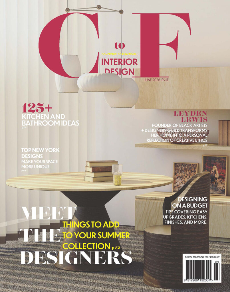
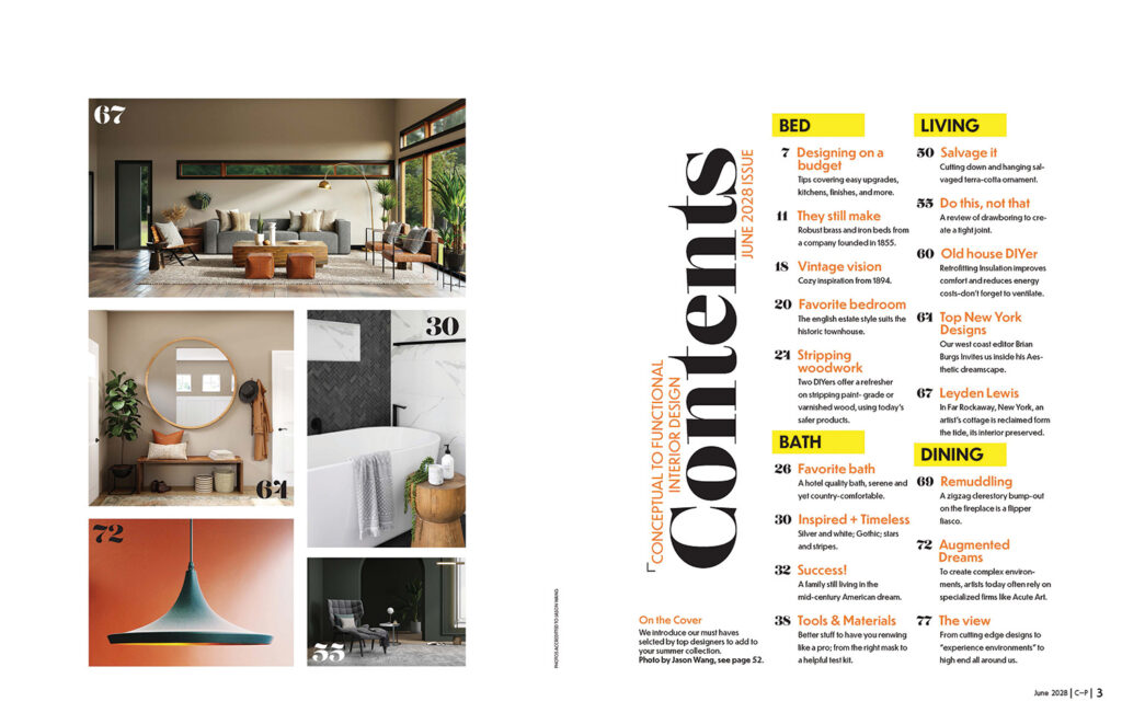
Modern/Mid-century aesthetics was the beginning focus of this project to create a direction for what was to be chosen for typefaces, images, colors, and other design elements. The image you see was not the first image chosen but because of design issues such as color/visual balance and overall quality, this beautiful one was chosen. With bringing together design elements a new focus also came into mind. Spacious, clean, and livable. Some magazines you see are very unrealistic in the way that someone actually lives so comfort is a must. Throughout the other pages, the same feel was carried throughout by carefully using color sampling that would also work well with other images and design choices.


Publication
- Pricing
- Progress
- Booklets
- Branding
illustration
- Illustrator
- Logos/Icons
- Sketches
About Me
- Contact
- Other Projects